 Sialkot, Pakistan
Choose collection colours by deciding what each colour does, which garments carry it, and which complete outfits it must work with. Then turn that plan into identified physical references and a style-by-colour list before sampling. A row of attractive swatches is a starting point; it does not tell a supplier whether the clay shade belongs on every hoodie, one overshirt, or only a small label.
For a clothing-brand buyer developing hoodies, T-shirts and trousers, the useful question is: How can we build a recognisable palette without adding colours that duplicate a role or complicate the range? This guide develops a practical answer through garment assignments, outfit comparisons and a clear handoff to sampling.
The examples below are hypothetical planning briefs, not Athletic Rush stock, customer orders or sales forecasts. All six images are original conceptual illustrations. Their displayed colours explain design decisions and are not physical colour standards or measured production results.
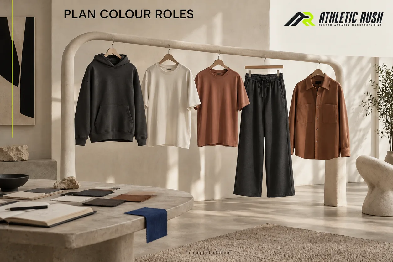
Concept illustration: a palette becomes useful when its colours have named garment roles.
1. Give the palette a job before choosing more shades
Start with a short wearing brief. Identify the intended wearer and the situation: an everyday capsule to combine with an existing wardrobe, a graphic-led drop, or coordinated pieces intended to be worn together. Describe the garments and the combinations that matter. “Premium colours” or “colours for everyone” leaves too much open.
A practical brief might read:
Studio Range: a charcoal pullover hoodie and trousers, a chalk T-shirt for layering, and a muted clay T-shirt and overshirt for an alternative outfit. Review the range with plain light and dark footwear. The clay overshirt must work open over the chalk tee as well as closed.
This is a design intention. It is not evidence that charcoal will sell better than clay. Existing customer feedback, relevant order history or a focused buyer discussion can inform the brief when you have them. Record what that evidence actually covers. Feedback on a previous black hoodie does not automatically establish demand for a new black cargo trouser in a different fit or market.
Use roles, not a universal colour ratio
Helpful working roles include a foundation colour, a supporting colour and an accent. These are planning labels, not fixed rules. A foundation can be the colour repeated across major pieces; a supporting colour can create a second outfit route; an accent can appear on a selected garment or a small detail.
There is no need to force every collection into the same number of colours or a fixed percentage formula. A two-colour capsule with deliberate garment assignments may answer the brief. A broader range may need several families because it serves different wearing situations. The buyer should be able to explain why each addition exists.
Ask three questions about a proposed shade:
- Which actual garment or detail will carry it?
- Which existing piece will the wearer combine it with?
- What does it add that the current choices do not already provide?
If two pale shades are both intended to serve as the same plain layering tee, compare them directly. Keep both only if their difference has a useful role that you can communicate. “We liked both swatches” is weaker than “one belongs to the warm-toned outfit, while the other is the deliberate contrast under the dark overshirt.”
Separate the brand mark from the garment palette
A brand identity colour can appear in packaging, a woven label or a small print without becoming the body colour of every garment. Equally, a collection can deliberately use that colour across its major pieces. Choose the application, rather than treating the logo colour as an automatic instruction for all fabric.
For a hypothetical Signal Range, a brand could place cobalt on a small chest detail while keeping the hoodie body charcoal. A different brief might use a cobalt hoodie as the main statement piece. Those decisions create different garments even though the colour name is the same.
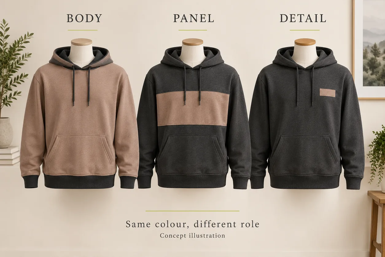
Concept illustration: colour area and placement change the design decision. These are three proposed applications, not measured colour matches.
Check the colour on the area where it will be used
View a body-colour proposal on a garment-sized representation, not only on a small square. For a panel or graphic, show its planned position and area. Include the hood, sleeves, back and visible trim where relevant.
This is a visual composition check. It helps the buyer decide whether the colour occupies the intended amount of the outfit; it does not prove dye achievability, print durability or physical shade accuracy.
A useful revision says, “Keep clay on the lower front panel; return the hood and sleeves to charcoal.” “Make it less bright” leaves both the target and the application uncertain. If the shade itself is the issue, identify that as a separate colour-reference decision.
2. Build outfits, then edit the garment-colour list
A collection does not have to make every piece interchangeable with every other piece. Decide which combinations are intentional and review those complete outfits. This avoids paying attention only to individual garments that look attractive in isolation.
For the Studio Range, lay out these three combinations:
- Charcoal hoodie with chalk trousers.
- Clay overshirt over a chalk tee with charcoal trousers.
- Chalk tee with clay cargo trousers.
These combinations illustrate a broader palette exercise; they are not a requirement to include all of those styles in one launch. If the actual brief includes only the hoodie, tees, overshirt and charcoal trousers, mark the other trousers as exploratory proposals rather than confirmed range items.
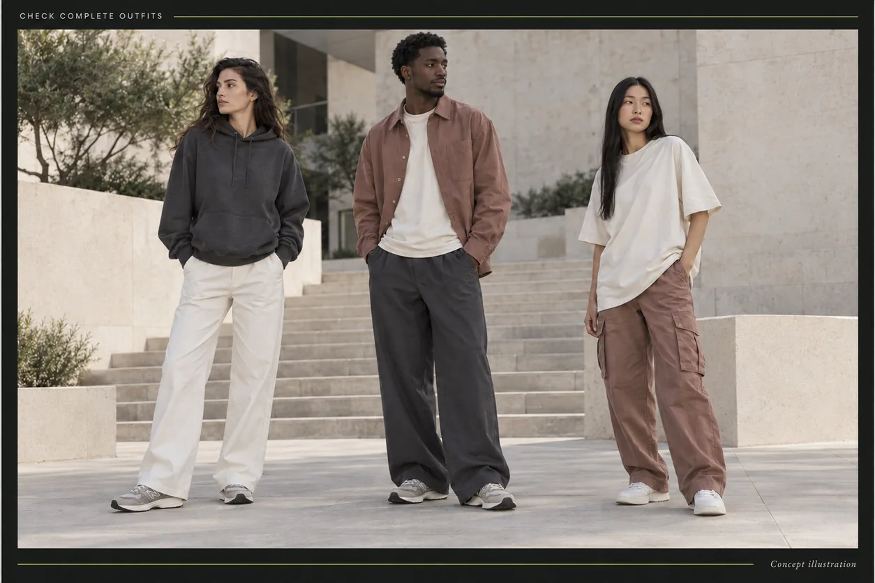
Concept illustration: review colour relationships in complete outfits, including visible underlayers and footwear.
Compare the combinations in the wearing arrangement
For an overshirt, review it open and closed. For a hoodie under a jacket, include the visible hood and lower hem. For a tee tucked into trousers, assess the smaller visible area as well as the untucked view. A colour relationship seen on two flat garments may change when one covers much of the other.
Review both the intended light and dark footwear if those are part of the brief. Ask whether the outfit gives the intended separation between top and bottom, whether a detail is visible enough, and whether one piece dominates more than the buyer wanted.
Use consistent views for a comparison: the same outfit arrangement, a similar camera angle and a clearly recorded colour proposal. An attractive photograph with different lighting, styling and editing for each option cannot isolate which change influenced the choice.
Do not confuse a visual preference with a performance result. These checks establish whether the proposed arrangement meets the design brief. They do not establish colourfastness, wash behaviour, accurate cross-material matching or customer demand.
Map each colour to a style instead of filling every cell
The following is a hypothetical edited range. Colour names are working descriptions; identified physical references will still be needed.
| Garment | Proposed colour assignment | Reason for the assignment |
|---|---|---|
| Pullover hoodie | Charcoal | One foundation outer layer for the capsule |
| Oversized T-shirt | Chalk and muted clay | Two distinct layering and standalone routes |
| Wide-leg trousers | Charcoal | Shared bottom for the chalk tee and clay overshirt |
| Overshirt | Muted clay | A supporting outer layer with a different material surface |
| Small brand detail | Colour decided separately | Review visibility and intended relationship on each garment |
This plan has three collection colours, but it does not give every style all three. That distinction matters when you discuss sampling, quantities, product listings and reorders.
If the clay tee and clay overshirt are meant to relate visually, state whether they are intended to match closely or simply belong to the same colour family. A shared name is not a complete matching instruction. The hoodie set component colour guide explains the separate problem of coordinating different materials and trims.
Count the options that you actually intend to offer
A colour decision creates a specific garment option when assigned to a style. With five offered sizes for every option in the hypothetical table, the hoodie has five style-colour-size combinations, the two tee colours have ten, the trousers five and the overshirt five: 25 combinations in total.
If all four styles were instead offered in all three colours and five sizes, the total would be 60 combinations. This is arithmetic under stated assumptions, not a stock recommendation. It says nothing about how many units to order in each combination, available minimums or the popularity of a colour.
Shopify's official variant guidance describes size and colour as product options whose combinations can form variants. Regardless of your selling platform, keeping an explicit option list makes the range easier to discuss than saying “three colours, five sizes” without identifying the styles.
Before removing a colour, ask what the removal changes. Eliminating one tee colour may remove an outfit route; removing the same colour from a garment that had no defined role may simplify the range without losing the intended combinations. Make that decision against the brief, rather than aiming for the smallest number on a spreadsheet.
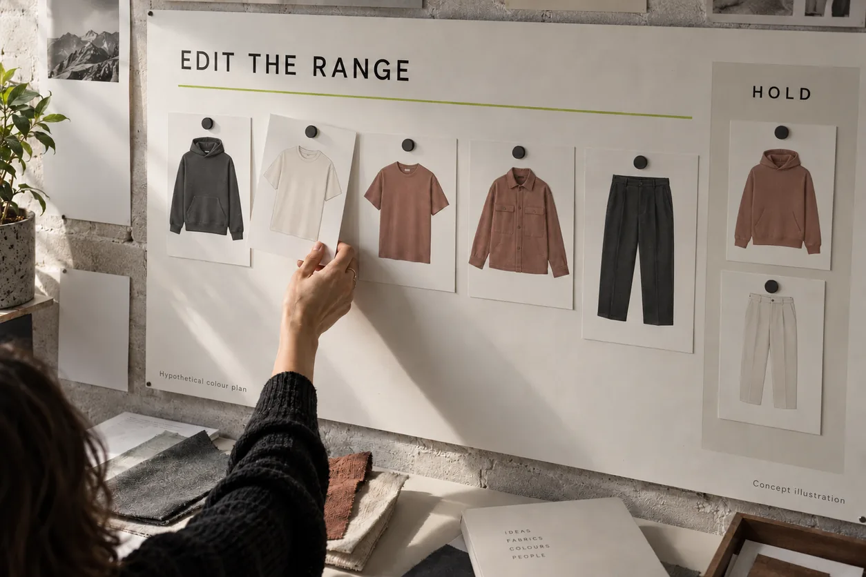
Concept illustration: the selected range and held proposals are separated. The board represents garment-colour options, not production quantities or sales results.
Make held options visible
Use simple decision states: selected for development, held for comparison, or removed from this range. Include a short reason and a version date in the buyer's working record.
For example: “Clay hoodie held: compare against charcoal before adding another outer-layer colour.” This is useful if a designer later reintroduces the proposal. It is clearer than allowing an old mood board to remain beside the final line plan with no indication of which one governs the next step.
For a collection focused only on hoodies, the small hoodie collection planning guide develops style roles and assortment decisions further. Here, the purpose is to decide colour assignments across the actual garments in your range.
3. Turn the palette into a usable sampling brief
Once the colour roles and outfit combinations are chosen, translate them into references that the supplier can identify. Separate an inspiration image, a physical colour target, a proposed material and a garment sample. They serve different purposes.
Pantone's physical-sample guidance explains why a recent, unfaded physical reference matters when a digital project moves into a physical product. A screen palette is useful for discussing the collection, but it should not be the sole reference for the fabric shade you intend to develop.
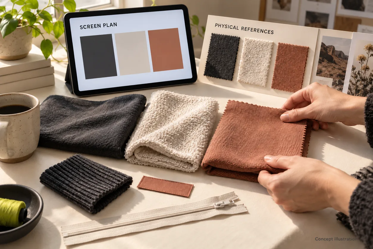
Concept illustration: a screen plan, fabric references and component choices belong in different parts of the brief. No illustrated swatch is a production standard.
Give the supplier a reference hierarchy
State which identified reference defines the colour target and which files explain the design arrangement. A practical record can include:
- A working colour name and your internal identifier.
- The physical reference identification, version and material where applicable.
- The garments and components to which the target applies.
- The proposed material for each application and any feasibility question still open.
- The collection board version and the selected or held state.
- The person responsible for resolving the open decision.
If you use a commercial colour system, record its complete identifier and the relevant reference format. If you use a physical fabric sample instead, label and retain that exact reference. Do not invent a code from a screenshot or send only a cropped photograph with “this brown.”
Ask the supplier whether the proposed shade is available or needs development for the intended material, and whether the components require separate sourcing or colour work. Availability, quantity requirements and timing must be confirmed for the actual order. A planned palette does not establish any of those terms.
Distinguish matching from coordinating
The charcoal hoodie body, rib and cord may be intended to match. The charcoal hoodie and a clay overshirt may be intended to coordinate while remaining visibly different. Write those relationships separately.
For the Studio Range, the instruction could be:
Clay tee and clay overshirt: same intended colour family, separate identified fabric proposals. Do not substitute the overshirt target into the tee brief. Present the two physical proposals together for the next colour review.
That instruction keeps the collection intention visible without claiming that different materials already match. If close matching is essential, state it and agree on the physical review and acceptance process before approving colour samples. Exact shade acceptance is a later decision; choosing the collection palette does not complete it.
Review decoration and trims with their assigned garments
Show the intended artwork colour on each garment colour at its proposed size. A mark that is deliberately subtle on charcoal may need a different treatment on chalk. Ask whether the goal is a tonal appearance or clear visual separation.
This is a design check, not a claim that one decoration method will reproduce every shade identically. Keep the decoration specification and physical sample review separate. The same applies to labels, drawcords, zipper tape and buttons: specify whether each should match, contrast or remain a consistent component across the range.
If a material change is proposed, reopen the relevant colour decision. A replacement surface or finish should not silently inherit approval just because its working name is also “clay.” Keep the original reference and show what changed.
Write revisions that identify the decision
| Observation during palette review | Specific next instruction |
|---|---|
| Two pale tee proposals appear to serve the same outfit role | Compare both with the selected overshirt; choose one or document a distinct role for each |
| The clay panel occupies more of the hoodie than intended | Reduce the assigned panel area in the design proposal; retain the existing shade target for now |
| A tonal chest mark is less visible than the brief requires | Present a contrasting artwork-colour option at the same size and placement |
| The tee and overshirt are called clay but have different reference records | Identify the intended relationship and present both physical proposals together |
| A held colour reappears on the line plan | Confirm whether its decision state changed; update the plan version and reason |
| The digital mockup and physical reference look different | Identify the governing target and resolve the physical proposal before approving the shade |
The aim is to change one clearly named decision at a time. “Improve the colours” could mean replacing a shade, reducing its area, changing the artwork or removing a garment option. It does not tell the supplier which action the buyer wants.
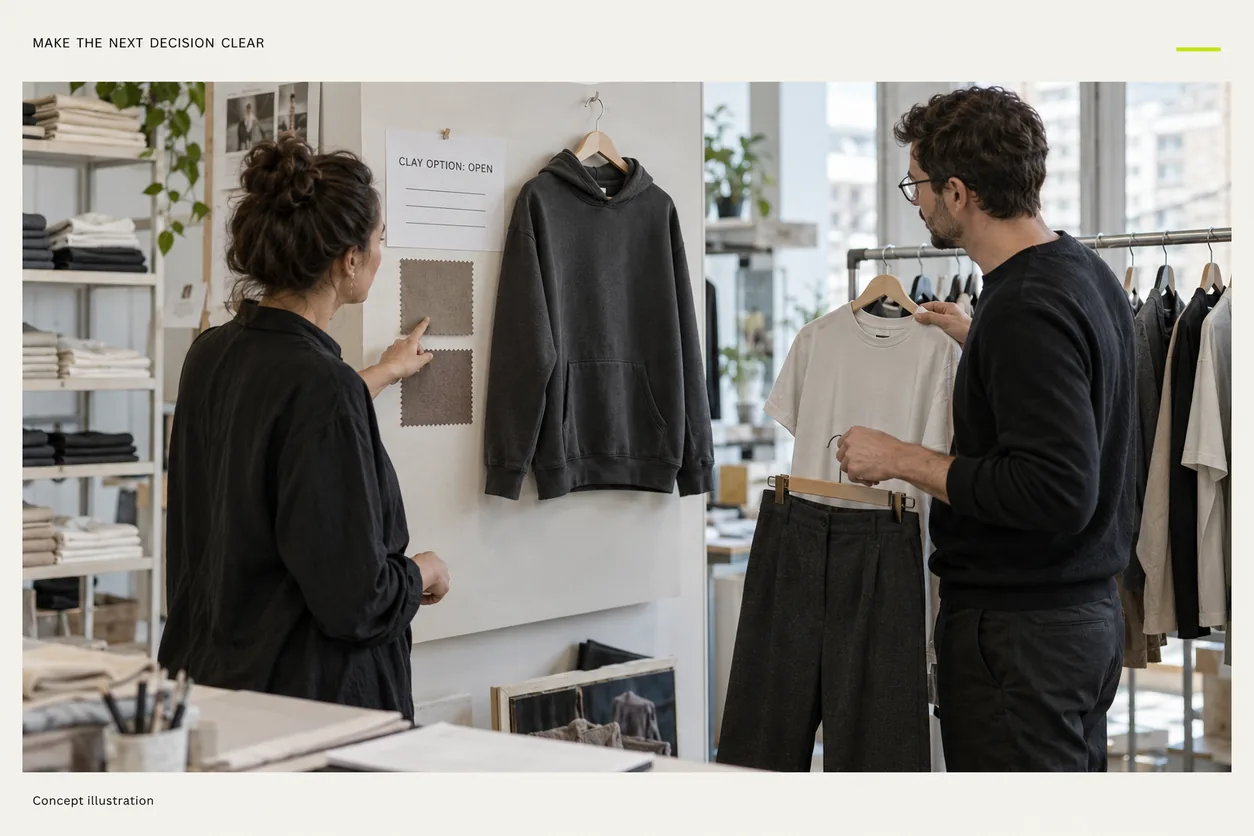
Concept illustration: unresolved choices remain visibly open until the relevant physical proposal has been reviewed.
A useful palette handoff has three outputs
Before sampling, prepare a colour-role brief, a style-by-colour list, and an identified reference pack. The brief explains the intended outfits; the list shows what is actually being developed; the references tell the supplier what each colour description refers to.
Check that every selected colour has a garment application, every proposed outfit uses identified options, and every held choice remains marked as open. Confirm who will review material feasibility and physical colour samples next. Keep quantity allocation and order terms explicit rather than deriving them from the mood board.
This is how a palette becomes a working collection decision. It allows sampling to answer the remaining physical questions instead of reopening an undefined assortment.
Questions clothing-brand buyers ask
How many colours should a first streetwear collection have?
Choose enough to fulfil the defined garment and outfit roles. There is no universal number. Start with an explicit style-colour list, explain each option's purpose, and confirm the sampling and order implications with the supplier. A smaller palette still needs clear assignments.
Should every garment use the same colours?
Only if that serves the range brief. A foundation trouser can support several top colours, while an overshirt may have one deliberate supporting colour. Offering every colour on every style increases the number of combinations and should be an intentional assortment choice.
Can a photograph or HEX code specify a fabric colour?
Use digital references to explain the direction and arrangement, then identify the governing physical target for fabric development. A photograph or display value alone is not approval of the physical material shade. Record the reference format and the relevant garment or component.
Does choosing a palette approve the production colours?
No. Palette planning selects the intended colours and applications. Material feasibility, physical shade proposals, component relationships and the agreed acceptance process still need review. Keep the selected design direction separate from any later sample approval.
Discuss your collection with Athletic Rush
Send Athletic Rush your garment list, intended outfit combinations, colour assignments and available physical references. Mark uncertain shades and held options clearly so the next discussion can focus on the choices still to be resolved.
Explore the streetwear range, email kamran@athleticrush.co, or discuss your brief on WhatsApp at +923279008337.