 Sialkot, Pakistan
 Worldwide enquiries

A second kit should give your club a useful alternative when the first kit clashes. If both designs read as the same dominant colour from the touchline, changing a collar or adding a new pattern may not solve the problem. The aim is to create two recognisable club looks that also work as different playing options.
This guide explains how to choose home and away soccer kit colours, compare complete combinations, assess numbers and approve the physical colour reference before a bulk order. It is written for club coordinators, coaches and teamwear buyers preparing a clear supplier brief.
Start with the function: Decide what the alternate kit must do before choosing decorative details. Check the requirements for your own competition, then compare the whole kit rather than a cropped shirt mockup.
1. Create two distinct looks around one club identity
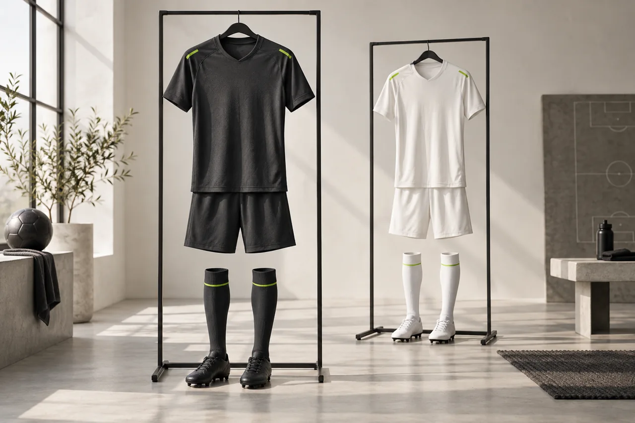
Write down the elements that make the kit recognisably yours: the crest, a core colour, a characteristic trim or a simple design motif. Then separate those identity details from the large areas of colour that determine how the kit appears at a distance.
For example, a predominantly charcoal home kit and a predominantly off-white alternate can share a small lime accent and consistent crest placement. They belong to the same club visually, but the alternate is more than the home design with a different collar. The illustrated palette is an example, not a recommended combination for every competition or opponent.
Set the two complete designs beside each other. Include the front, back, sleeves, shorts and socks. A dark front with a light back may create a different comparison when players turn around. Record those differences rather than describing a complex shirt with a single colour name.
Do not choose an alternate only because it photographs well beside the home shirt. Ask what kind of clash it is intended to resolve and compare it with the likely opposition where that information is available. Keep the current competition's requirements in the decision, including any kit registration or approval process it uses.
2. Confirm the rules before finalising the artwork
In association football, the IFAB's Law 4 requires the teams' colours to be distinguishable from one another and from the match officials, and gives separate colour requirements for goalkeepers. Read the current IFAB Law 4: The Players' Equipment alongside the rules of your own competition.
Ask the organiser which shirt, short, sock, number and sponsor requirements apply to your team. Check who decides the match-day combination and whether kit details must be supplied before the season. Do not assume the labels “home” and “away” automatically determine which design is permitted at every fixture.
Keep the organiser's answer with the order specification. If the supplier proposes an artwork change, check whether it affects anything already approved. A design mockup from a manufacturer is not a substitute for the organiser's decision about competition use.
This article uses soccer as its example. Buyers ordering basketball, netball or another sport should check that sport's applicable rules rather than applying the soccer requirements to every uniform.
3. Compare the kits from the touchline, not only on a screen
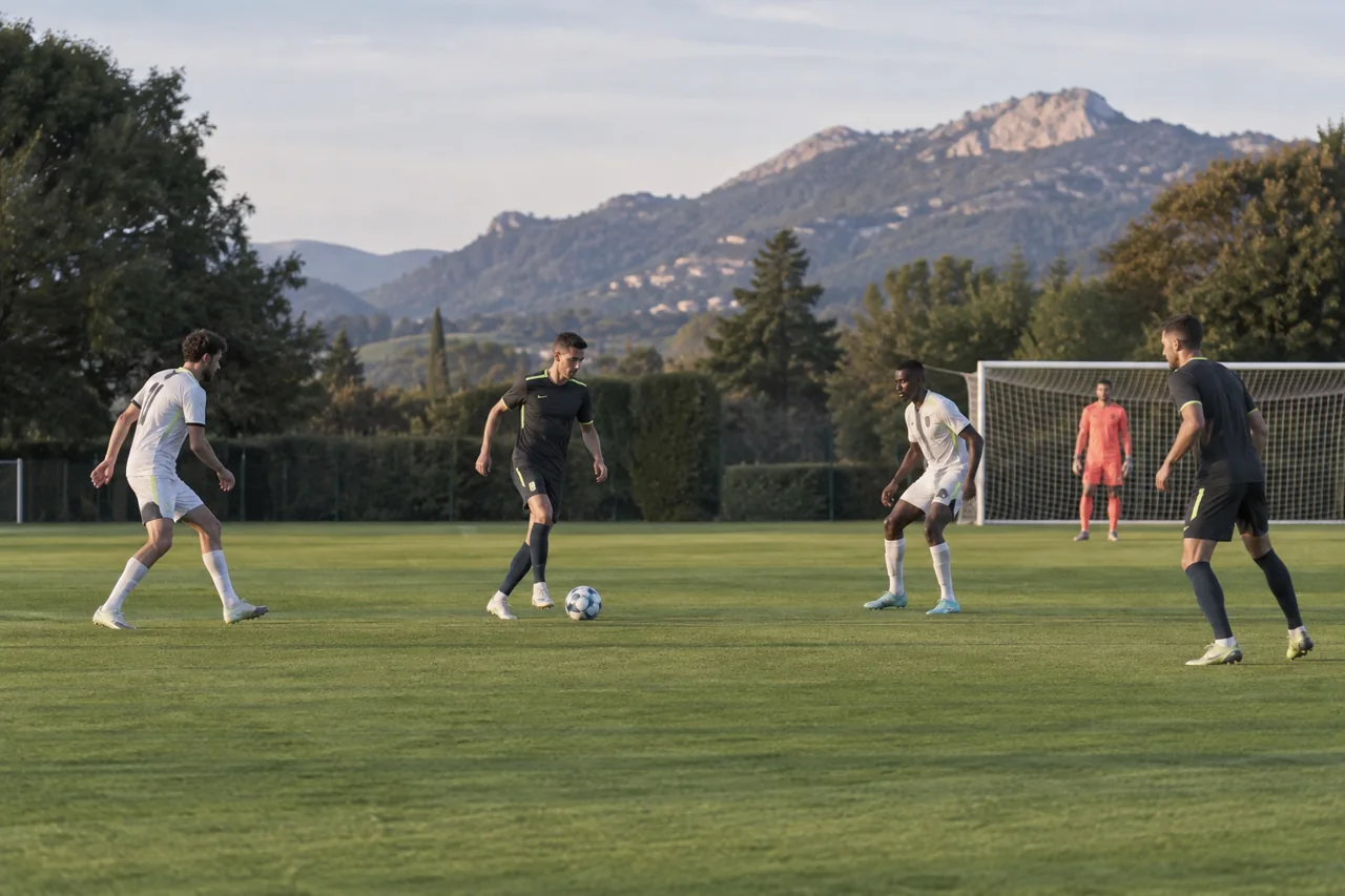
Place physical samples on people or display forms in a realistic viewing space. Step back and compare the overall appearance from the front, back and side. Ask someone who did not choose the designs to describe the difference they see. This can reveal that a striking close-up detail contributes little to the distant appearance.
Try the comparison in the lighting conditions relevant to your club, such as daylight and the training venue's lights. A phone photograph can document the test, but automatic exposure and screen settings can change the apparent colour. Use the actual garments for the final physical comparison.
Look beyond the colour names. Two differently named dark shades can still look similar at distance; two patterns may share so much of the same base colour that they are hard to separate quickly. A larger difference in light and dark areas is worth exploring, but no single visual test guarantees acceptance in every match.
Consider viewers who may not easily distinguish some colour pairs. Do not rely solely on a subtle hue change to make the alternate different. Where available, involve the club's accessibility adviser or ask the organiser for guidance. A grayscale image can be an additional design check for lightness, but cannot prove that a kit works for every viewer or replaces the on-field comparison.
Record the outcome in plain language: “both backs appear mainly dark at distance” is more useful to the designer than “the away one needs more impact.” Explain which area needs to change and ask for an updated full-kit view.
4. Give numbers and sponsor marks their own review
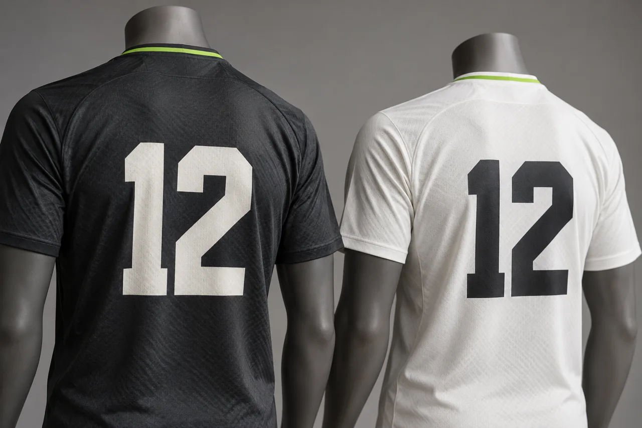
A number sits on top of the garment design. Assess it as part of the finished back panel, with the actual pattern, size and placement. A number that looks clear on a blank artwork sheet may become difficult to read when placed over stripes, gradients or a large decorative motif.
Compare the proposed number colour against the entire area behind the digits. Check the sample at a distance and while the wearer turns. Review representative one- and two-digit numbers, particularly where a number's width changes the space available. Use the dimensions and style permitted by your competition; this guide does not prescribe universal number measurements.
Ask the designer to show both colourways with the same relevant artwork elements. The home-kit number colour may need to change on the alternate. Similarly, a sponsor's dark logo may need an approved light version on a dark panel. Obtain the appropriate logo version rather than recolouring a sponsor mark without permission.
Check the crest, sponsor marks and numbers separately. Improving one must not conceal another or push it into an unsuitable position. Our logo and sponsor artwork guide explains how to prepare the files and placement references for this review.
Buyer checkpoint: Approve each colourway with its actual names, numbers and permitted marks shown. Do not approve an undecorated shirt and assume the personalised version will read the same way.
5. Approve colour on the intended fabric
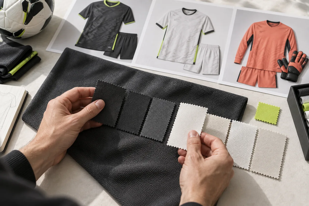
Treat the screen artwork as a design reference and agree how the supplier will establish the physical colour standard. Provide any existing approved garment or physical reference you need them to match, and identify the exact shade you mean. A request for “our usual navy” leaves too much room for interpretation.
Ask for the proposed colour on the intended material and with the intended decoration process. A print trial on another fabric may be useful during development, but should be identified as such. Record which sample or swatch is the final reference and which items are provisional.
Review the home and alternate references together under consistent lighting. Include trim and other material components where their colours need to coordinate. If a small difference is acceptable, describe and record the acceptance with the supplier rather than relying on an informal photograph.
For a light kit, also assess fabric coverage on the actual garment in its intended use and fit. A colour proof alone does not establish coverage. Use the fabric weight, stretch and coverage guide to organise the separate material checks.
Keep one identified approval reference and clear photographs for communication. If a later order uses a different fabric or production route, ask the supplier to reassess the colour match; a saved digital colour value alone does not show how the finished garment will appear.
6. Include the goalkeeper and every wearable combination
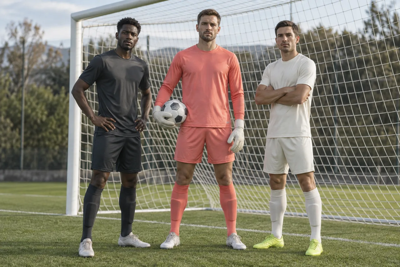
Do not leave the goalkeeper choice until the outfield designs are already fixed. Compare it with both of your proposed outfield kits, then confirm the relevant competition and fixture requirements. The coral example in this guide illustrates a third colour family; it is not a claim that coral will work against every opponent or official's kit.
Think in complete combinations. If the club may combine an alternate shirt with a different short or sock option, show that combination explicitly for review. Do not assume every mix of individually approved components is automatically suitable.
Build a simple kit matrix to keep the options visible. Add actual references rather than relying on colour names alone.
| Kit option | Shirt reference | Shorts and socks | Number treatment | Decision still needed |
|---|---|---|---|---|
| Primary outfield | Approved home artwork version | Exact matching item references | Colour, style and placement | Competition confirmation |
| Alternate outfield | Approved alternate artwork version | Exact alternate or agreed shared items | Checked on this back design | Physical colour approval |
| Goalkeeper option | Distinct goalkeeper artwork version | Specified goalkeeper combination | Checked on this fabric and colour | Comparison with match requirements |
| Any mixed combination | Exact shirt version | List each substituted item | Confirm unchanged readability | Separate combination review |
The final column is a prompt for your own decisions, not a finding about your club. Replace it with the current status and the person responsible. Keep unresolved combinations out of the final production instruction until the relevant choices are settled.
7. Release an approval pack that prevents colourway mix-ups
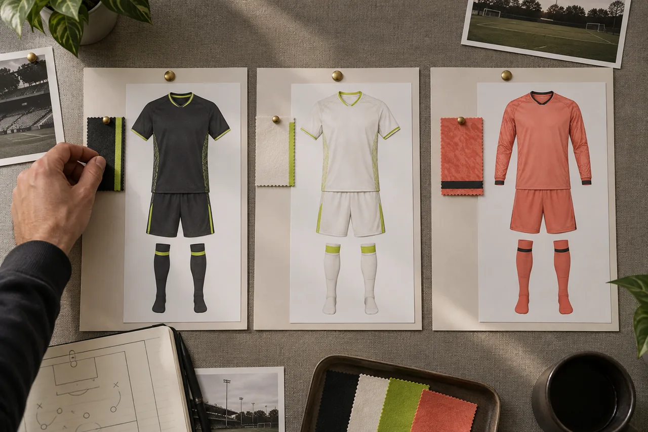
Give each kit a clear identifier in the order: for example, Home H1, Alternate A1 and Goalkeeper G1. Use the same identifiers on the artwork, quotation, roster and packing instructions. File names such as “final shirt new final” make it difficult to trace which version was approved.
Specify quantities by garment, size and colourway. If every player needs both shirts but only one pair of shared shorts, state that directly. If the away shorts differ, allocate them separately. The team size chart and player roster guide can help you keep the individual allocations consistent.
Retain the final front and back views, fabric references, colour approvals, number treatment and organiser correspondence together. Tell the supplier which older versions are superseded and ask them to acknowledge the final pack before proceeding.
On receipt, inspect both colourways against their own references. The right total number of shirts does not prove the correct home/alternate split arrived. Keep the approved pack for reorders so a replacement kit is compared with an identified version rather than someone's memory of the original shade.
A practical example: same identity, a useful alternate
Imagine a club whose primary shirt is dark with a bright trim. Its first alternate proposal is another dark shirt with the trim enlarged. Side by side on a monitor, the designs look different, but the backs remain mostly dark when worn on the field.
The coordinator asks for an alternate with a predominantly light front and back, retaining the small trim and crest placement. The designer then shows a dark number on the light back, the complete short and sock combination, and the goalkeeper option alongside both kits. The club compares samples and obtains the relevant competition confirmation before releasing the order.
The useful change is not simply more decoration. It is a complete alternate that has a defined purpose, a readable personalisation treatment and its own approval reference. Your club's final choice may be different; use the same decision process with your actual colours and requirements.
Send a clear home and away kit enquiry
Browse Athletic Rush teamwear and send the following information with your enquiry:
- Club, sport, competition and any supplied kit requirements.
- Existing primary colours, crest files and physical references.
- Intended purpose of the alternate and known clash concerns.
- Complete home, alternate and goalkeeper garment lists.
- Quantities and fit groups for each colourway.
- Names, numbers, sponsor files and unresolved permissions.
- Sample requirements, delivery destination and target date.
- The person who will consolidate and approve the final pack.
Email kamran@athleticrush.co, message WhatsApp +92 327 9008337, or use the quote enquiry form. Ask for full-kit views and a physical colour approval plan for your proposed order.
Common home and away kit questions
Must the alternate always be white?
No universal requirement to use white is established here. Choose an alternative around your competition's requirements and the clashes it needs to address. The light kit in the images is an example.
Can we keep the same shorts for both shirts?
Assess and confirm the complete combinations for your use case. If shared shorts are agreed, specify the shared item reference and quantities clearly so the supplier does not count two complete sets by mistake.
Is a digital colour code enough for approval?
It is useful design information, but agree a physical reference on the intended material as well. Keep the sample identity and approval record with the artwork.
Does this checklist mean our kit is competition-approved?
No. It helps prepare the order and identify decisions. Obtain the relevant organiser's confirmation and follow the applicable match requirements.
The images are AI-generated educational examples featuring fictional people and kit designs. They do not show an actual customer order or establish competition approval for the illustrated combinations.